There’s a problem with how we’ve been modeling our investments so far. It is not unique to us. Almost everyone does it wrong.
But, we’re going to fix it now.
The issue is the assumptions we’ve been using and how the real world actually works.
For the analysis we’ve been doing with The World’s Greatest Real Estate Deal Analysis Spreadsheet™ (TWGREDAS)—and any other real estate deal analysis spreadsheet—we’ve used static assumptions.
We might assume that property values are going up by 3% per year. Well, that’s not truly a correct representation of reality.
Heck, with the overrides tab in TWGREDAS we may have said, they go up by 3% for the first 3 years and then only 2% thereafter. Better, but still not reality.
The truth is: we really don’t know how much property values will go up as we hold the property. They could go up by 3%. They could go down by 3%. They could go up then down or down then up. Could be more or less than 3%. Might be 3.1% or 2.9%. Might be up or down 6% or 10%.
If we look back at history (and we do when we consider the risks of investing in real estate), we can see what property appreciation has done over the last 100 years.
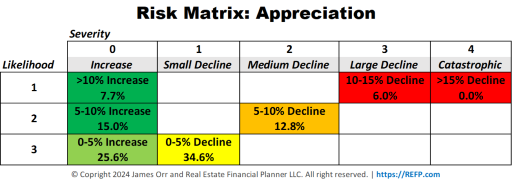
So, to correctly model how our investment might perform, we should not use a static 3% per year—or whatever static number you believe to be true—for property appreciation.
Our crystal balls are broken. We can’t accurately predict—exactly—what appreciation will be for our properties.
We can guess. Based on what has happened in the past they will average about 3% per year.
But they may:
- Increase in value by more than 10% for the year about 7.7% of the time
- Increase between 5% and 10% for the year about 15% of the time
- Increase between 0% and 5% for the year about 25.6% of the time
- Go down in value between 0% and 5% for the year about 34.6% of the time
- Go down in value between 5% and 10% for the year about 12.8% of the time
- Go down in value between 10% and 15% for the year about 6% of the time
These are based on what has happened over the last 100 years. Could the future be different? Absolutely.
But it is much more accurate than just assuming that they will be going up in value by 3% per year every year.
Not Just Property Appreciation
As you probably guessed, this isn’t just an issue with property appreciation. It applies to other assumptions we have as well.
Here’s a list of some of the more significant ones:
- Property Appreciation Rate – This is the one we’ve been talking about already. It is how much properties go up or down in value.
- Rent Appreciation Rate – This is how much rents increase or decrease with each lease renewal.
- Inflation Rate – Inflation reflects the overall increase in prices and the decrease in purchasing power over time. It impacts everything from the cost of goods and services to the value of money itself. In the context of your portfolio, inflation affects how much your money will be worth in the future, influencing the real returns on your investments. For instance, even if your rental income and property values rise, high inflation could erode those gains in terms of actual purchasing power. A million dollars today isn’t the same as a million dollars 50 years ago and it won’t be the same as a million dollars 50 years from now.
- Mortgage Interest Rates – Mortgage Interest Rates – Mortgage rates fluctuate over time. The rate you secure for your current property purchase or refinance won’t necessarily be the same for properties you buy in one, five, or more years from now.
- Stock Market Rate of Return – This is how much you’re earning on money you have invested in the stock market. This also applies to other investments you might have like savings accounts, bonds, CDs, cryptocurrencies, etc.
If you really want to go to freaky town, you could also model this with changing tax rates, insurance rates, maintenance and capital expenses on the property.
Does This Even Matter?
Does this even matter and why should I care?
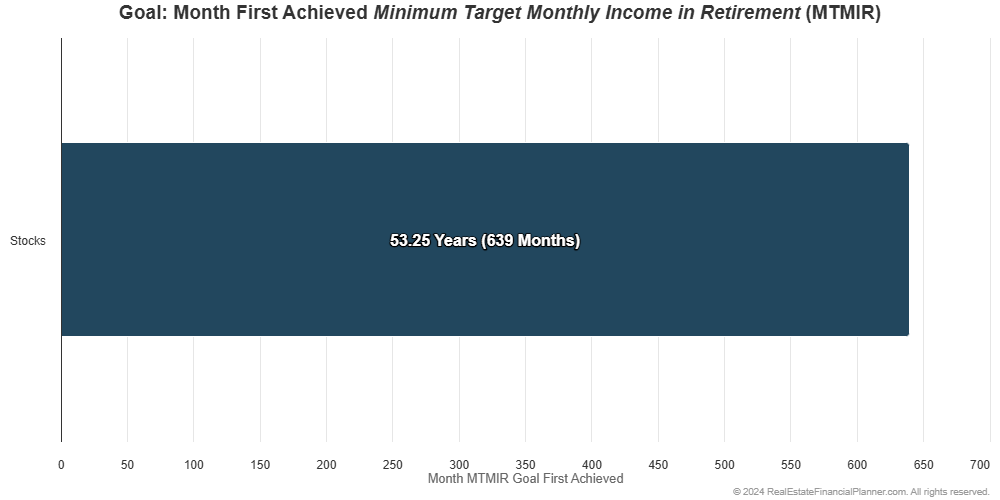
Let’s start with a simple example of someone who invests in stocks. They don’t even buy a home to live in; they rent instead.
They invest approximately 10% of their income in the stock market earning 8% per year.
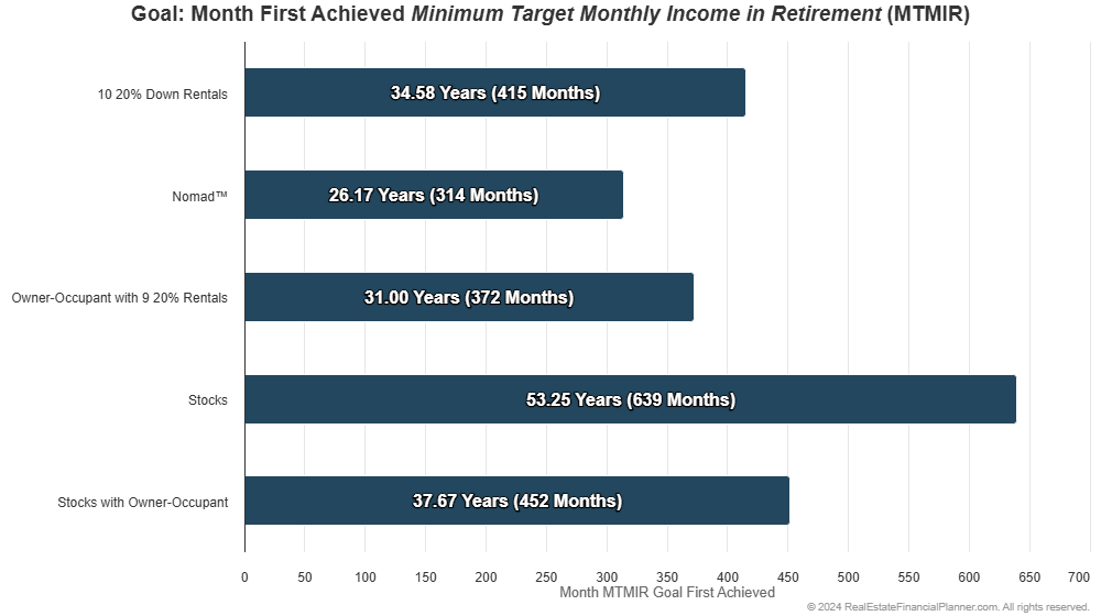
Using static assumptions, we could calculate that they would be financially independent (FI) after about 53.25 years.
But what if we used a reasonable range of values for the return from the stock market instead of always 8% every year?
We could use a range of values that better approximates what the stock markets has done historically—still averaging about 8% for this particular selection of stocks.
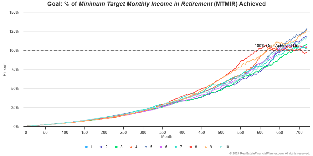
Instead of seeing a smooth line showing their journey toward financial independence like his:
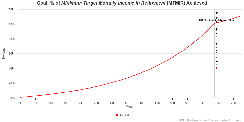
We’d instead see a less smooth line representing how the stock market returns change each month like this:
And, if we ran it 10 times, you’d see that when they actually achieve financial independence (when the line crosses the horizontal dotted line) is a little different each time.
If the stock market performs well, they’re financially independent earlier. If the stock market does not perform as well, they end up being financially independent later.
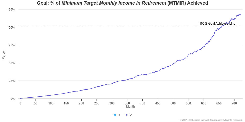
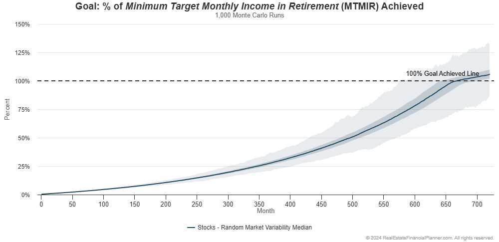
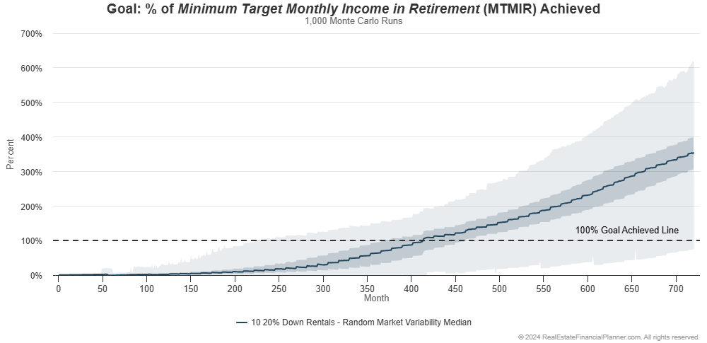
If we ran this 1,000 times and summarized the results, we can see the range of when they’re financially independent.
Monte Carlo Modeling
This type of analysis is called Monte Carlo modeling.
Monte Carlo modeling is a statistical technique used to simulate multiple potential outcomes for an investment or financial scenario.
It works by:
- Running hundreds or thousands of simulations with varying input parameters
- Analyzing the range and probability of different outcomes
- Providing a more nuanced understanding of potential risks and returns
For real estate investing, Monte Carlo analysis involves varying input factors such as property appreciation rates, rent increases, mortgage interest rates, inflation, and market returns. This approach allows you to better assess the likelihood of achieving your financial goals and understand the potential risks associated with your investment strategies.
I like to call it Alternate Universe Modeling™ because we’re consider how you’re investments might perform if you were living in alternate universes with different futures.
Back to our example with someone just investing in stocks.
In the chart above:
- The light blue band shows the full range of results from the very worst to the very best.
- The darker blue band in the middle shows you the middle 50% of all runs. Half of the time the results are this darker band.
- The dark link at the very center shows you the median value. Half the values are higher than this. Half the values are lower than this.
If we look at the median line we can see that half the time they’re financially independent around 58 years. Half the time it is after 58 years.
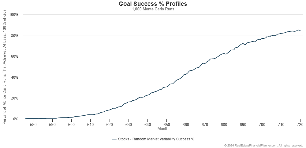
It could have been as early as year 48. And, it could take longer than 60 years—when we stopped modeling for this example. In fact, only about 85% of the 1,000 runs we ran were financially independent 60 years from when they started.
We can summarize this is a different chart and show what percentage of the 1,000 runs were financially independent in each month.
That’s this chart:
By using a range of values for things like the stock market rate of return, we get a much more nuanced understanding of what is likely to happen.
What If They Became Home Owners Instead of Renting?
Our last example they were renting a property to live in and investing in stocks.
What if they bought on owner-occupant property with 5% down to live in and invested in stocks?
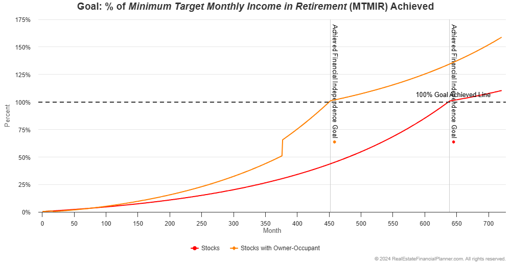
If we used static assumptions they would be financially independent about 15 and half years faster:
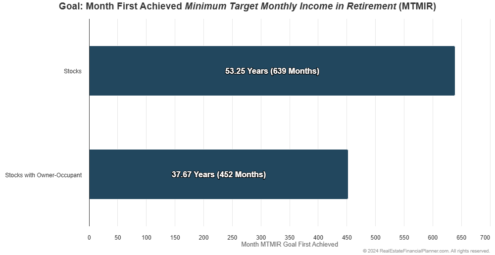
Part of what gets them to financial independence faster is that they end up paying off their owner-occupant property 30 years after they buy it. Without a mortgage payment the threshold for them being financially independent is a little lower.
There’s a little more to this story, but I don’t want to go off into the weeds here. The punchline is they achieve financial independence faster with static assumptions as you can see below:
Let’s vary the property appreciation rate, mortgage interest rate, inflation rate, and stock market rate of return. If we were discussing rentals, we’d vary the rent appreciation rate as well but in this case they’re not buying any rentals; we’ll get to that shortly.
With variable property appreciation rates, mortgage interest rates until they lock in a 30-year fixed rate financing loan, inflation rate and stock market rate of return it looks like this:
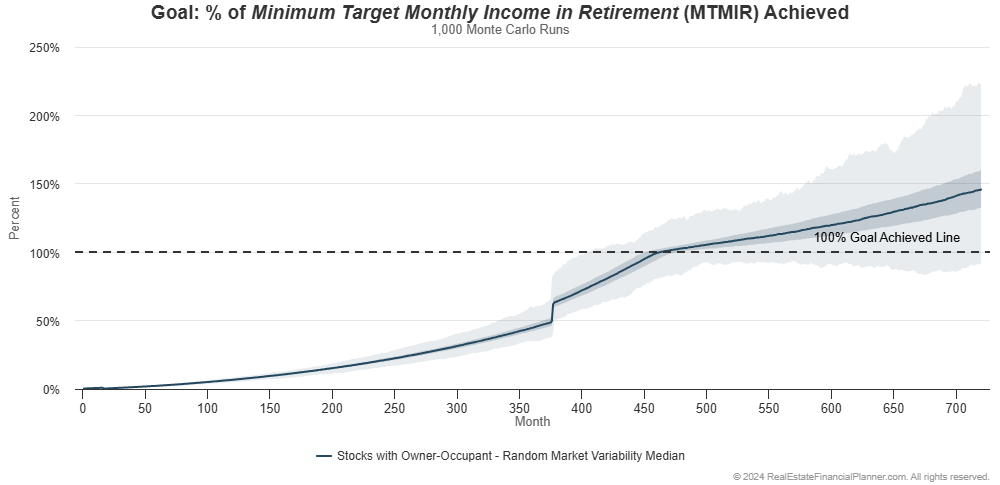
They’re financially independent as early as about 33.75 years from when they start. In 99.5% of the 1,000 runs they’re financially independent by the time we stop modeling at 60 years.
How does this compare to them just investing in stocks? Let’s show both of them on one chart:
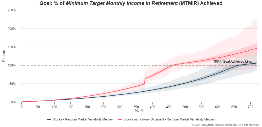
Buying an owner-occupant property seems to make a pretty big difference.
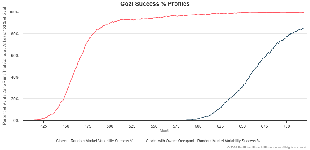
If we just look at what percentage of the 1,000 runs they achieve financial independence, you can see that buying the owner-occupant property is more probable (higher percentage of the runs achieve it) and they’re financially independent earlier (it happens more to the left on the chart).
Buying Rental Properties with 20% Down Payments
Let’s assume, for now, that they don’t buy an owner-occupant property with 5% down. Instead, they decide to buy 20% down rental properties as their primary real estate investing strategy.
Any additional money beyond what they need for the rentals is still investing in stocks, but whenever they get enough for a 20% down payment they buy a rental property with very modest cash flow.
They’re willing to buy up to ten 20% down payment rentals.
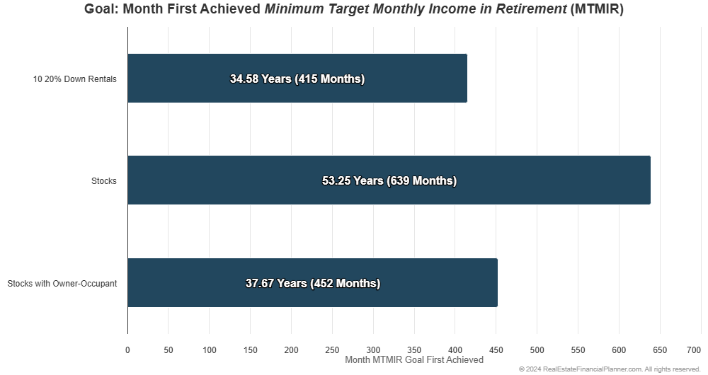
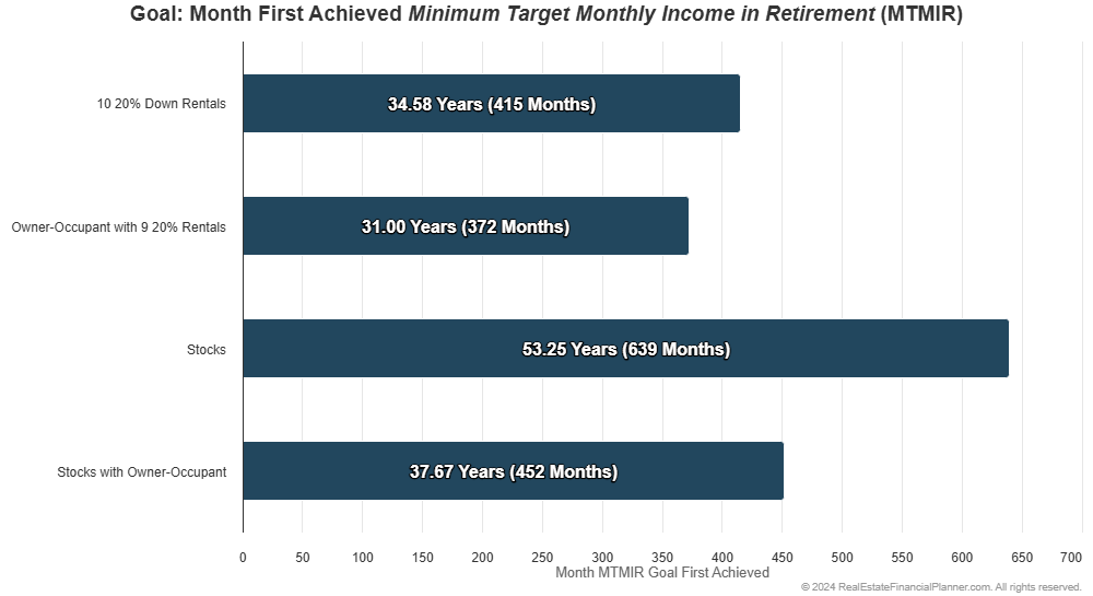
If we have static assumptions for property appreciation, rent appreciation, inflation, mortgage interest rates and the stock market rate of return, they might be financially independent after 31 years.
With static assumptions, that’s about 18.67 years faster than just investing in stocks and about 3 years faster than buying an owner-occupant property and investing stocks:
With static assumptions, they achieve financial independence faster:
And, still looking at the chart above, they appear have a lot more income coming then just investing in stocks the longer they hold the rental properties.
In fact, they’re earning about twice what they need to be financially independent about 48.5 years in. That means they’re earning twice what they need to be financially independent before just investing in stocks as a renter is even earning enough for them to financially independent at all.
Not long after they achieve financial independence just investing in stocks as a renter, they’re earning 3 times what they need to be financially independent with their 10 rentals.
But, this is about Monte Carlo modeling, so what if we did vary property appreciation rates, rent appreciation rates, inflation, mortgage interest rates and the stock market rate of return?
It is important to realize that because the property prices vary with each run sometimes the properties they’re buying can be slightly more or less expensive. On average though, property prices are going up at about 3% per year.
Rent is similar. Rents can go up or down, but overall, rents are increasing by about 3% per year.
Mortgage interest rates started at about 8.5% for a non-owner-occupant loan without paying significant points. But, mortgage interest rates can get better—or worse—over time as they’re acquiring properties. That means sometimes properties will cash flow better and sometimes they’ll cash flow a little worse.
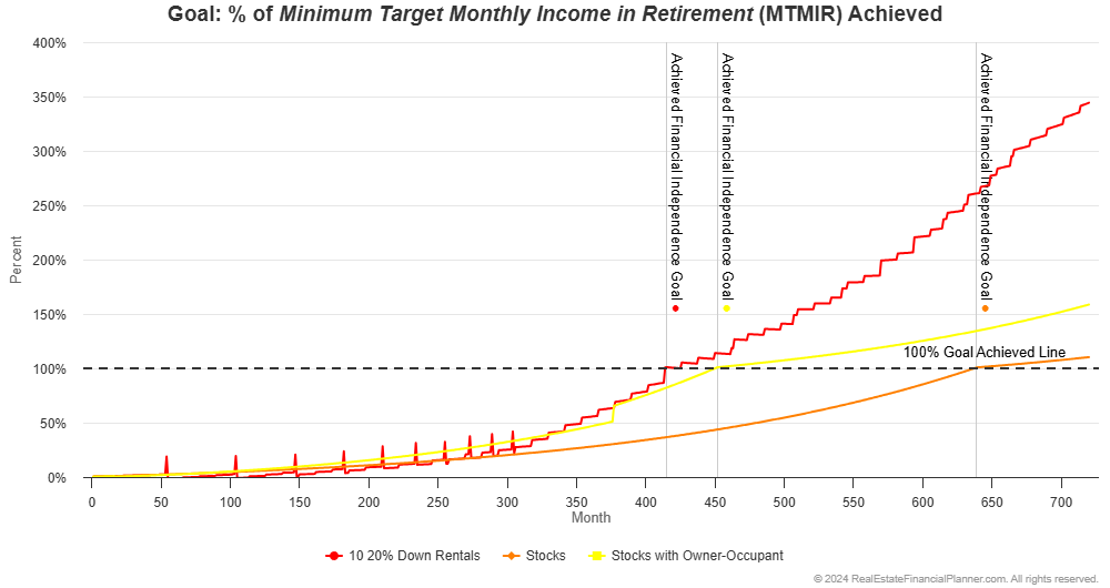
Let’s look at their journey to financial independence buying ten 20% down payment rentals in the chart below:
You can see there are times when the market goes in their favor (both the real estate and stock market) they achieve financial independence early. And, there are times when they still don’t quite achieve it through 60 years.
How does it compare to the two previous strategies: renting and investing exclusively in stocks and buying an owner-occupant property and exclusively investing in stocks?
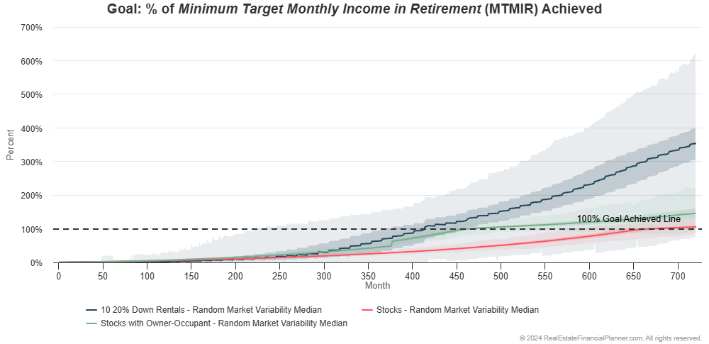
It is getting harder to see what is happening in the chart as we add additional comparisons.
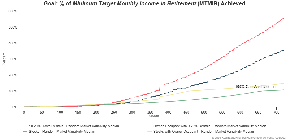
We can make it easier in two different ways. First, we can look at the same chart, but turn off the shaded areas for each strategy.
This would leave just the median—or the middle-most result—where half of them are better and half are worse.
That’s this chart:
This chart doesn’t show up the range of results (how early or late they achieve FI) but it does show how much more they’re likely earning by buying the rentals by what percent of their financial independence goal they’re earning.
By earning a higher percent of the amount they need to be financially independent, they’re able to support a higher standard of living.
In other words, if they needed to be earning $10,000 per month passively to be considered financially independent, but their earning 200% of that—or $20,000 per month—they could live at a much higher standard of living on $20,000 per month than the $10,000 per month that they needed—at a minimum—to be considered financially independent.
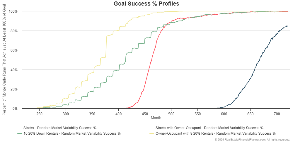
The second way to make it easier to see what is happening is looking at the percentage of the 1,000 runs that achieved financial independence like we did previously.
That’s this chart:
Buying ten 20% down payment rentals sees them achieving financial independence earlier (more left on the chart above) and then has a similar success rate to what they’d see if they bought an owner-occupant and invested in stocks.
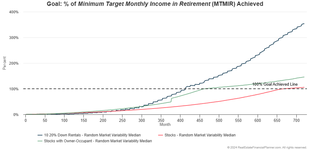
Owner-Occupant, Rentals and Stocks
I think you know what’s coming next: what if they bought an owner-occupant property with 5% down, then bought up to nine more rental properties, each with 20% down payments and invested the rest in stocks?
With static assumptions that’s about 3.5 years faster than just renting and buying ten 20% down payment rentals:
If we do Monte Carlo modeling it looks like this:
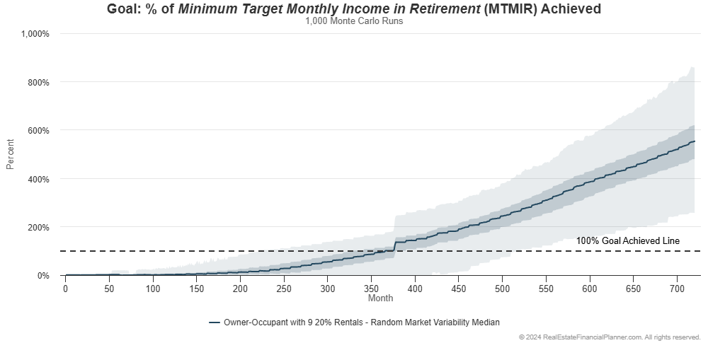
Doing a very busy version of this chart by comparing it to the other strategies so far, it looks like this:
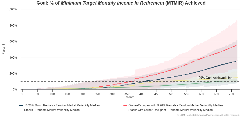
If we just look at the 50th percentile (median) value for the four options:
It shows that buying the owner-occupant property and nine 20% down payment rentals appears to be faster and gives them a higher standard of living than even buying ten 20% down payment rentals.
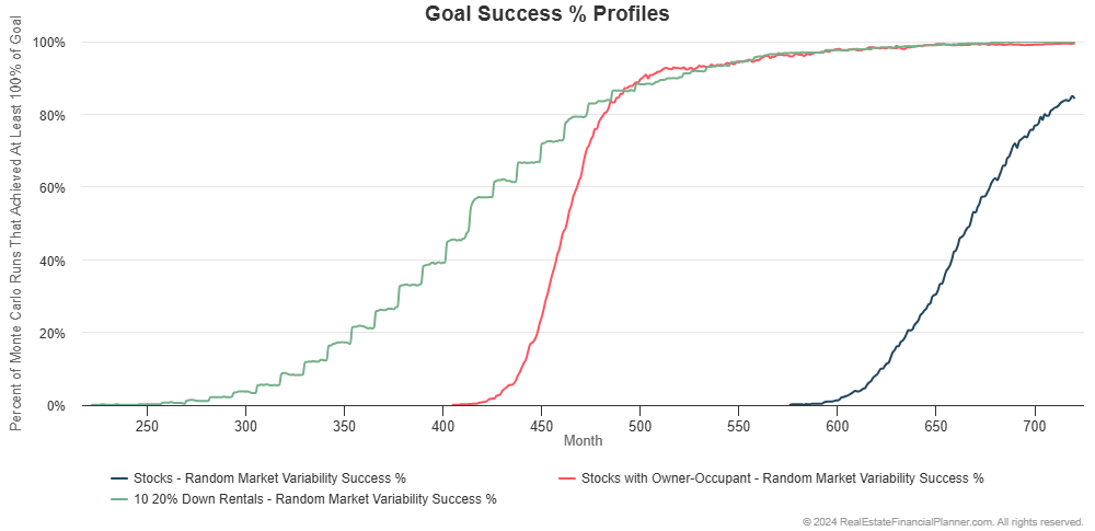
If we look at the percentage of the 1,000 runs for reach strategy that achieved financial independence and when, we can see that buying an owner-occupant property and then nine 20% down rentals is the best performer yet:
In the chart above you can see that not only does financial independence tend to happen faster (a little to the left on the chart), it also tends to be more consistent (a higher percentage of the runs achieve FI).
Nomad™ Real Estate Investing Strategy Example
There’s so much more we could do with this, but for now I’ll wrap it up with a slight curve ball.
Instead of buying an owner-occupant property and then buying nine 20% down payment rentals, let’s imagine they Nomad™.
- They buy an owner-occupant property with 5% down payment.
- They live there for at least a year. That’s a requirement of the lender to get an owner-occupant loan with an owner-occupant down payment and owner-occupant mortgage interest rate.
- Once their year is up AND they’ve saved up enough for another 5% down payment, they buy another owner-occupant property and move into it.
- They take the previous property they were living in and convert it to a rental property
- They repeat this until they have 9 rentals and the property they’re living in
Instead of having to save up for 20% down payments, they acquire the same nine rental properties with only 5% down on each by moving into each one as an owner-occupant.
Is this better? Is this more probable for them to be financially independent? Is this faster to financial independence? Does this give a higher standard of living than the other strategies so far? And—we won’t cover it here because it is a longer discussion—but is it more or less risky?
It turns out that with static assumptions (not Monte Carlo modeling yet), Nomad™ is 58 months (almost 5 years) faster to financial independence.
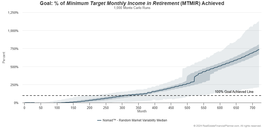
If we add variability and do Monte Carlo modeling, we can look at how the Nomad™ strategy performs in the chart below:
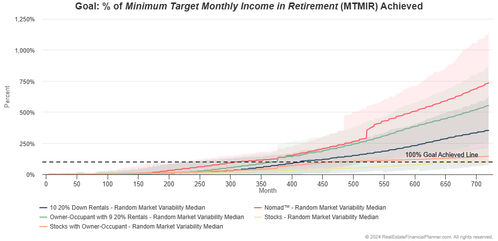
Brace yourself for the busy version comparing them all at the same time:
And, if we turn off the range of results and just look at the middle most (median) of the 1,000 runs for each strategy, we can see the following:
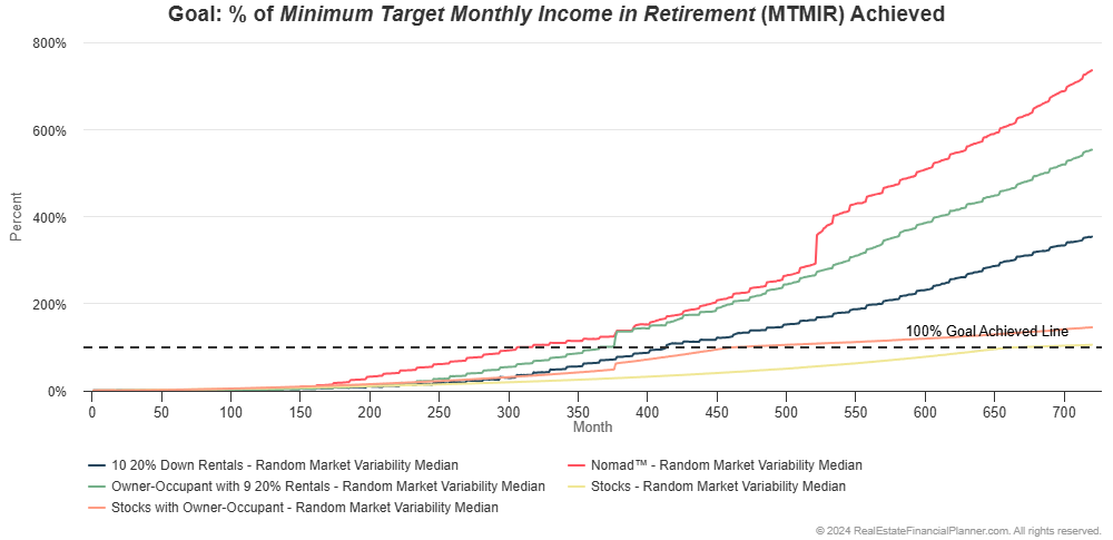
Still a bit busy to see what is going on, but I will point out, in the chart above, the Nomad™ strategy seems to give them the fastest achievement of financial independence and highest standard of living.
Isn’t it interesting.
If we look at the percentage of the 1,000 runs that achieve financial independence and by when you can see even better:
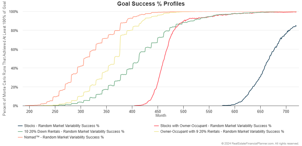
The Nomad™ strategy achieves financial independence earliest (to the left on the chart above). It also has a higher probability of being financial independent earlier.
Additional Modeling
Now that we know the importance of considering the variability that might occur in the future, this is really just the beginning.
There is a ridiculous amount more to dig into here. We’ve just barely scratched the surface.
There’s a lot more to model.
For example, we could model each strategy you’re considering seeing how each strategy performs:
- Buying long-term buy and hold rental properties (short-term rentals, medium-term rentals, student rentals, storage units, assisted living, apartments, etc)
- Buying properties utilizing creative financing (owner financing, wrap financing, loan assumptions, rent-to-owns, agreements for deed, subject-to)
- Variations on the Nomad™ strategy (Nomad™ by Proxy, Nomad™ with House Hacking, Nomad™ to Short-Term Rental, Nomad™ with Lease-Option Exits, The Ultimate Real Estate Agent Retirement Plan™)
- House Hacking and related strategies
- Short-Term Rentals and related strategies
- Flipping properties and related strategies
- BRRRR and related strategies
- Becoming a hard money lender
- And much, much more
Or, combining one or more of these strategies at the same time (fix and flipping while acquiring long-term or short-term rentals as an example) or sequentially (fix and flipping for 10 years then switch to buy and hold).
Or, we could test a wide assortment of variations to your strategy:
- More or less reserves (and its impact on both speed and risk)
- More or less down payment size up to buying properties for all cash
- Buying down interest rates or not
- Getting roommates or not (house hacking)
- Selling via lease-options versus with a real estate agent or for sale by owner
- Paying off properties early with extra cash flow versus not
- Doing cash out refinances to buy additional properties faster
- Buying properties and selling them when you could take the proceeds (after all expenses including taxes) and then investing that money in stocks, bonds or something else to be financially independent
- Buying more properties than you need and selling them to pay off properties when it means you’d be financially independent
- And much, much more
Not Just Financial Independence
When we do these models, it is important to consider more than just how fast you’re able to get to financial independence—even though that’s what we focused on here.
Sometimes it is about your standard of living once you are financially independent. Some strategies might just barely get you to your minimum required income to be financially independent. While others will give you far more each month than you initially stated you needed allowing you live at a much higher standard of living than you originally required.
Sometimes, it is about measuring, comparing and ultimately minimizing risks. Some strategies are riskier than others. They might get you to financial independence, on average, 1 year faster, but there’s a 20 times greater chance you’ll run out of money by pursuing that strategy than another one that gets you to financial independence, on average, a year slower.
That all might be worth considering… especially for your own unique situation.
It is important for you to evaluate your own strategy utilizing Monte Carlo modeling to better understand how to achieve financial independence faster, easier, with higher probability of success, with a higher standard of living and with less overall risk.
Or, if you going to ignore one or more of those things, deliberately and strategically choosing to ignore them with full knowledge of the consequences.